


A bedroom is your personal space that contributes to relaxation, quality of sleep, rest, and intimacy. When choosing the best bedroom paint colors, there are a few important factors to consider. Apart from your ultimate design style, considerations such as temperature, square footage, and ambiance have a major call. Generally, warm colors are known to create a stimulating effect whereas cool colors have a calming effect. Well, in this article, we’re going to discuss the 4 important rules to follow when choosing paint colors for your bedroom.
Key Highlights
- Neutral tones with subtle gray undertones, like greige or blue-gray, create a calming and timeless bedroom atmosphere.
- Accent walls in deeper shades such as navy or olive green add personality without overwhelming the space.
- Natural lighting, paint undertones, and room orientation significantly influence how colors appear and feel.
- Bold hues like red and yellow should be avoided in bedrooms as they can disrupt relaxation.
Opt for Neutrals

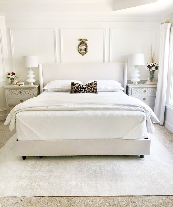
Say goodbye to brighter and bolder tones whereas say hello to the calm and soothing neutral paint colors. Your neutrals can be warm or cool in saturation - but must have a ‘gray’ undertone to tone down the color. Colors such as blue grays, green grays, beige, greige, gray, and darker off-whites can play a fundamental role. A beautiful example of a warm and cool-toned neutral is Sherwin Williams Agreeable Gray, and Sherwin Williams Passive.
Keep it Timeless

You may simply adore a paint color for your bedroom but is it truly timeless and will not fade away, even years down the line? It’s ideal to keep your bedroom paint color simple, classic, and timeless, specially is paired with neutral floor tiles. Yes, a paint color that doesn’t intimidate you and make you and your space feel monotonous in the coming years. Avoid choosing a design idea that is “trendy”! One ideal example is Sherwin Williams Alabaster.
Avoid Feeling Boxed In

You don’t need to paint all the walls in a single paint color and feel ‘boxed in’! Styling an accent wall is a great way to infuse color and make the bedroom feel eye-catching and phenomenal. Choosing a darker neutral paint color such as Sherwin Williams Naval or Sherwin Williams Retreat on the accent wall can equally do wonders!
Kick Out Reds for Blues and Greens

Red is the color of romance and yellow is the color of friendship - but in a bedroom space, these color families definitely don’t make the cut. Such bright and intimidating warm colors are subjected to keeping you away from being calm while injecting the utmost energy. Hence, not something to feel restful around - after a long day at work. On the other hand, blue and green color families are associated with nature and can help relax and soothe you.
Expert Tips About Room Lighting
Understand the Room’s Lighting & Orientation
Lighting greatly affects how a color appears. North-facing rooms benefit from warm, creamy hues while south-facing rooms handle cool grays and blues better.
Test Before You Commit
Use large paint samples or peel-and-stick swatches to observe how colors look at different times of the day. Always test in natural and artificial lighting conditions.
Don’t Ignore Undertones
Many neutral paints have hidden undertones, be it green, blue, pink, or violet. Place swatches next to white to reveal the true undertone and avoid surprises.
Focus on Mood
Want to feel cozy, relaxed, or inspired? Match your mood to your palette. Calm = cool colors. Cozy = warm neutrals. Bold = rich accent walls.
Coordinate With Décor
Choose colors that harmonize with your existing furniture, bedding, and floor tiles to create a seamless, balanced look.
Conclusion
Your bedroom is more than paint—it's a personal sanctuary. Combining calming neutrals, carefully-considered undertones, the effect of light, and strategic accenting will result in a space that's both peaceful and enduring. Embrace colors that soothe, not shock—especially as your needs and tastes evolve.